Template Basics
This page shows the minimal HTML structure every Feather Flow template needs. You will create the first file of the Demo Planner running example - a single cover page with a background image and a title.
Key topics
Minimal HTML boilerplate for a planner template.
The
basevariable and how it keeps asset paths working.The
.pagediv pattern and page sizing.Adding a full-page background image.
Generating the HTML output with pyplanner.
Minimal template
Create a new file planners/demo/demo.html with the following content. The
planners/demo/ directory and its assets/ subfolder already exist in the
repository with pre-made background images. Our Demo Planner uses half-letter
paper (5.5 x 8.5 in):
<!doctype html>
<html>
<head>
  <meta charset="utf-8">
  <style>
    @page { size: 139.7mm 215.9mm; margin: 0; }
    html, body { margin: 0; padding: 0; height: 100%; }
    .page {
      position: relative;
      width: 139.7mm; height: 215.9mm;
      overflow: hidden;
      page-break-after: always;
      break-after: page;
    }
  </style>
</head>
<body>
  <div class="page">
    <h1 style="text-align: center; padding-top: 70mm;">
      Demo Planner
    </h1>
  </div>
</body>
</html>
There are a few things to notice here.
The base variable
Every template receives a base variable. Prefix every asset path with it:
<link rel="stylesheet" href="{{ base }}/assets/my-style.css">
<img src="{{ base }}/assets/cover.png">
Pyplanner sets base to the template’s directory path so that asset references
work regardless of where the output file is written. For PDF generation it
becomes an absolute file:// URI so the headless browser can find every
asset.
The .page div
Every planner page lives inside a <div class="page">. Look at the
<style> block in the minimal template:
@page { size: 139.7mm 215.9mm; margin: 0; }
html, body { margin: 0; padding: 0; height: 100%; }
.page {
  position: relative;
  width: 139.7mm; height: 215.9mm;
  overflow: hidden;
  page-break-after: always;
  break-after: page;
}
The @page rule tells the PDF generator which paper size to use. The
.page class sets the div to exactly the same dimensions so the browser
preview matches the printed page.
html, body { margin: 0; padding: 0; height: 100%; } removes default margins
and padding and sets the height to 100% to ensure the
page fills the entire viewport.
page-break-after: alwaysseparates pages in the PDF - each.pagediv becomes one printed page.overflow: hiddencrops anything that extends beyond the page edge.position: relativelets child elements position themselves inside the page.
Tip
Common paper sizes: size: A4 (210 x 297 mm), size: letter
(215.9 x 279.4 mm), size: A5 (148 x 210 mm). For sizes without a keyword,
specify width and height explicitly as shown above.
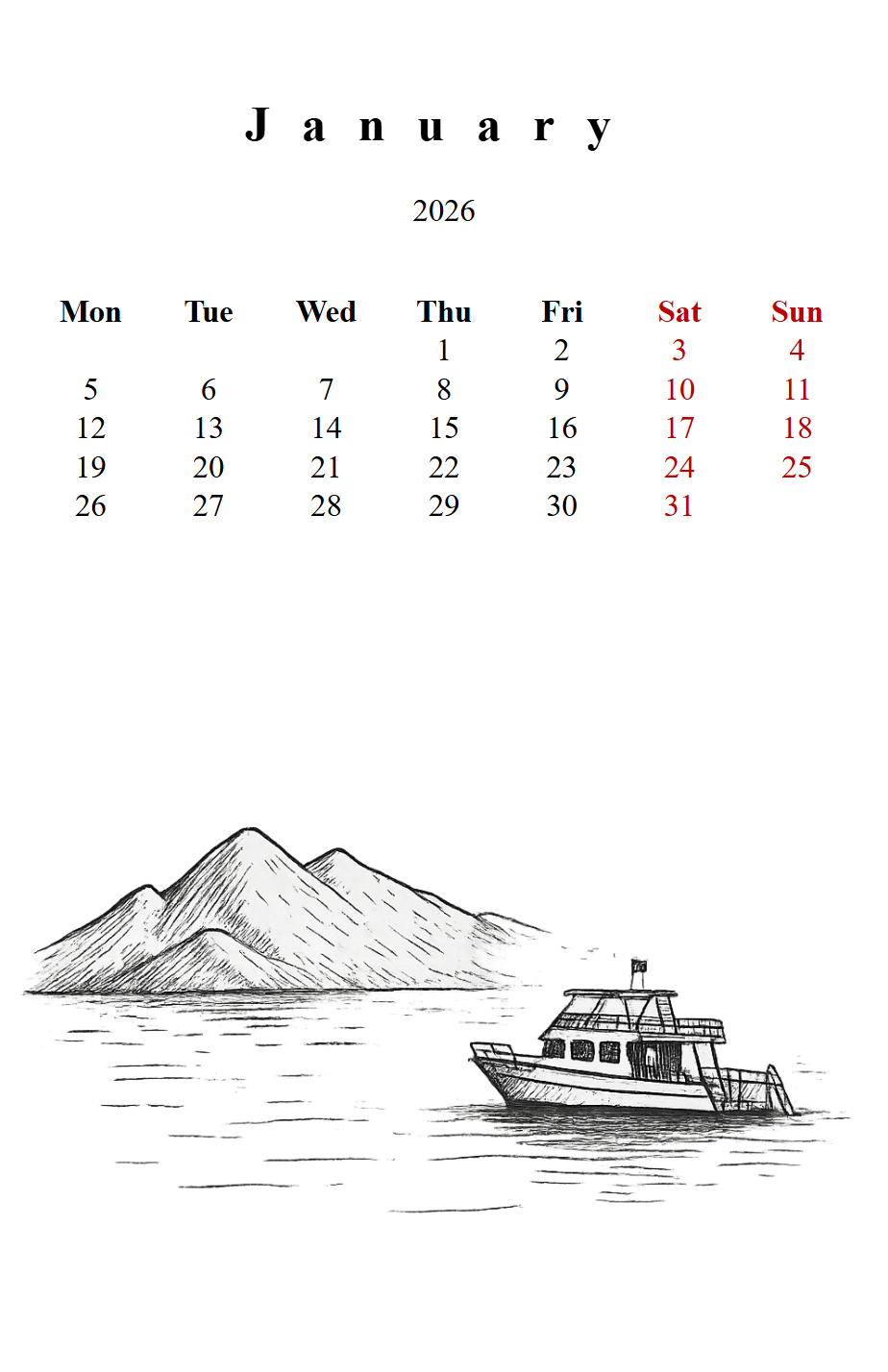
Adding a background
Background images are placed as <img> tags inside a .page div. To make
an image fill the entire page behind the content, add a CSS class. We will call
it .back:
.back {
  position: absolute; inset: 0;
  width: 100%; height: 100%;
  object-fit: cover; z-index: -1;
}
Add this rule to the <style> block and then use it inside a .page div:
<div class="page">
  <img class="back" src="{{ base }}/assets/cover.png">
  <h1 style="text-align: center; padding-top: 70mm;">
    Demo Planner
  </h1>
</div>
position: absolute together with inset: 0 stretches the image to the
edges of the parent .page div (which has position: relative).
z-index: -1 pushes the image behind all other content. object-fit: cover
scales the image to fill the page without distortion.
Linking a stylesheet
When your <style> block grows large you can move the CSS into a separate
file in assets/ and link it with a normal <link> tag. Paths should start
with {{ base }}/ so that the browser can find the file:
<link rel="stylesheet" href="{{ base }}/assets/demo.css">
The assets/ folder sits right next to the template inside the planner
directory, so the path is simply assets/<filename>.
See Assets and Styling for the full explanation of path rules.
Generate and preview
From the repository root run:
pyplanner planners/demo
A file called demo.html (the rendered output) appears in the repository
root. Open it in your browser.
If the background image shows and the title is visible you are ready to move on.
Tip
HTML is the default output format and is much faster than PDF generation
because it skips the Chromium step. Use --pdf when you need the final
file. See Live Preview for a workflow that reloads the browser
automatically.
Do and don’t
Do |
Don’t |
|---|---|
Prefix asset paths with |
Use absolute paths or leading slashes ( |
Wrap every page in |
Put multiple pages in one div. |
Move large CSS blocks into a separate file. |
Keep hundreds of lines of CSS inline when a linked file would be cleaner. |
Current state of the Demo Planner
After this page your template looks like this:
<!doctype html>
<html>
<head>
  <meta charset="utf-8">
  <style>
    @page { size: 139.7mm 215.9mm; margin: 0; }
    html, body { margin: 0; padding: 0; height: 100%; }
    .page {
      position: relative;
      width: 139.7mm; height: 215.9mm;
      overflow: hidden;
      page-break-after: always;
      break-after: page;
    }
    .back {
      position: absolute; inset: 0;
      width: 100%; height: 100%;
      object-fit: cover; z-index: -1;
    }
  </style>
</head>
<body>
  <div class="page">
    <img class="back" src="{{ base }}/assets/cover.png">
    <h1 style="text-align: center; padding-top: 70mm;">
      Demo Planner
    </h1>
  </div>
</body>
</html>
One page, one background, one title, half-letter paper. The {{ base }}/
prefix ensures the image path works regardless of where the output file is
written. Next we add dynamic content.
What is next
Continue to Variables, Expressions and Comments to learn how to use variables, expressions and comments in your template.