Assets and Styling
Every planner needs images, stylesheets and possibly custom fonts. This page explains where to put those files, how to reference them from a template and the CSS patterns that make pages look correct in both the browser and the generated PDF.
Key topics
Where to store CSS, images and fonts.
How asset paths work (relative to the planner directory).
Key CSS classes:
@page,.page,.back.Page breaks.
Custom fonts with
@font-face.Do and don’t for asset management.
Where assets live
All assets go in the assets/ subfolder inside the planner directory:
planners/
+-- demo/
    |-- demo.html
    |-- params.xml
    +-- assets/
        |-- cover.png
        |-- demo.css
        +-- cormorant-garamond.woff2
This layout matters because paths inside your template are resolved relative to
the planner directory (where the template lives). Since assets/ sits right
next to the template, the correct relative path from the template to any asset
is {{ base }}/assets/<filename>.
Path rules
Do |
Don’t |
|---|---|
|
|
|
|
|
|
Always prefix files paths with {{ base }}/. Pyplanner sets this variable to
the correct path prefix for the current output target so that the browser can
find every file.
Warning
Never use absolute paths or paths that start with /. They will break when
someone else clones the repository or when the PDF generator runs.
Linking a stylesheet
Use a standard <link> tag inside <head>:
<head>
  <meta charset="utf-8">
  <link rel="stylesheet" href="{{ base }}/assets/my-planner.css">
</head>
You can link multiple stylesheets. For example you might have one for layout and one for fonts:
<link rel="stylesheet" href="{{ base }}/assets/my-planner.css">
<link rel="stylesheet" href="{{ base }}/assets/cormorant-garamond.css">
Adding images
Background images use <img class="back">:
<div class="page">
  <img class="back" src="{{ base }}/assets/cover.png">
  <h1>My Planner</h1>
</div>
Inline images (such as icons or decorations) use a regular <img> tag without
the back class:
<img src="{{ base }}/assets/icon-star.png"
     style="width: 10mm; height: 10mm;">
Tip
Use PNG for images with transparency and JPG for photos. Keep images at a reasonable resolution - 300 DPI at A4 size is roughly 2480 x 3508 pixels. For non-detailed backgrounds 120 DPI is enough (~1024 x 1536 on A4 page).
Key CSS patterns
These are the essential CSS patterns every planner template needs. The Demo
Planner already uses them in its <style> block.
@page - paper size
@page {
  size: 139.7mm 215.9mm;
  margin: 0;
}
This tells the PDF generator which paper size to use and removes printer margins. Common values:
size: letter;- US Letter (8.5 x 11 in).size: A4;- international A4 (210 x 297 mm).size: A5;- half of A4 (148 x 210 mm).size: 139.7mm 215.9mm;- half letter (5.5 x 8.5 in).size: 200mm 300mm;- custom width and height.
When you change the @page size you must also update the .page div
dimensions to match so the on-screen preview is accurate.
.page - page container
.page {
  position: relative;
  width: 139.7mm; height: 215.9mm;
  overflow: hidden;
  page-break-after: always;
  break-after: page;
}
Every <div class="page"> becomes one printed page. The fixed dimensions must
match the paper size set in @page (the example above uses half letter -
139.7 x 215.9 mm). overflow: hidden crops anything that extends beyond the
page edge.
.back - full-bleed image
.back {
  position: absolute; inset: 0;
  width: 100%; height: 100%;
  object-fit: cover; z-index: -1;
}
Place an <img class="back"> inside a .page div and it stretches to fill
the entire page behind all other content.
Page breaks
The rule page-break-after: always on .page is what separates pages in
the PDF. If you create your own CSS make sure every page container has this
rule. Without it all pages will merge into one long document.
.my-page {
  page-break-after: always;
  break-after: page;
}
Custom fonts
Place font files in assets/ and create a small CSS file for them.
assets/cormorant-garamond.css from the Feather Flow 2026 planner:
@font-face {
  font-family: "Cormorant Garamond";
  font-style: normal;
  font-weight: 400;
  src: url(cormorant-garamond-normal-latin.woff2)
       format('woff2');
}

@font-face {
  font-family: "Cormorant Garamond";
  font-style: italic;
  font-weight: 400;
  src: url(cormorant-garamond-italic-latin.woff2)
       format('woff2');
}
Because both the CSS file and the font files sit in the same assets/ folder
the url() path is just the file name with no directory prefix.
Link the font CSS from your template:
<link rel="stylesheet"
      href="{{ base }}/assets/cormorant-garamond.css">
Then use the font in your styles:
.page {
  font-family: "Cormorant Garamond", Georgia, serif;
}
Tip
If you add a new font, provide both normal and italic variants (or whichever variants your design uses). Browsers will synthesize missing styles, but the result often looks worse than a real italic or bold file.
Do and don’t summary
Do |
Don’t |
|---|---|
Put all assets in |
Scatter files across random directories. |
Use relative paths: |
Use absolute paths or leading slashes. |
Use |
Set paper size through other means. |
Define |
Duplicate page sizing rules in every div. |
Use WOFF2 for custom fonts. |
Use TTF or OTF (larger files, slower loading). |
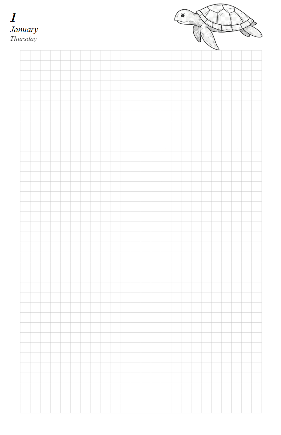
Update the Demo Planner
Add day pages to the Demo Planner. Each day gets its own page with a background
image and a header. Open planners/demo/demo.html and add
the following after the month calendar div, just before </body>:
## -- Day pages --
%% for day in month.days
<div class="page" id="{{ day.id }}">

  ## Put header index behind grid
  <img class="back" src="{{ base }}/assets/page.png"
       style="z-index: -2;">

  ## Square grid graph paper
  <div class="back">
    <svg xmlns="http://www.w3.org/2000/svg"
         width="139.7mm" height="215.9mm"
         viewBox="0 0 139.7 215.9">
      <defs>
        <pattern id="grid" width="5" height="5"
                 patternUnits="userSpaceOnUse">
          <path d="M 5 0 L 0 0 0 5"
                fill="none" stroke="#c0c0c0"
                stroke-width="0.2"/>
        </pattern>
      </defs>
      <rect x="10" y="25" width="120.1" height="180.1"
            fill="url(#grid)"/>
    </svg>
  </div>

  <div style="margin: 5mm; font-style: italic;">
    <p style="font-size: 18pt; font-weight: bold;
              margin: 0;">
      {{ day }}
    </p>
    <p style="font-size: 12pt; margin: 0;">
      {{ month }}
    </p>
    <p style="font-size: 10pt; margin: 0; opacity: 0.75; color: {{- day_color(day) }};">
      {{ day.weekday }}
    </p>
  </div>
</div>
%% endfor
The SVG element draws a square grid with 5 mm cells. The <pattern> defines
one cell and the <rect> tiles it across the content area (with padding
around the edges). The back class stretches the SVG to fill the page, and
z-index: -1 puts it behind the day header.
Because month is already set to January at the top of the template,
month.days gives us all 31 days. The month name is printed dynamically with
{{ month }} so if you change which month the planner covers the day pages
update automatically.
Regenerate:
pyplanner planners/demo
You should see 33 pages: 1 cover + 1 month calendar + 31 day pages. Each day page has a square grid background and a header with the day number, month name and weekday.
What is next
Continue to Live Preview to learn how to use --watch mode for a
faster edit-preview workflow.